MyHealth Chorley and South Ribble Clinical Commissioning Group
Design & Print
Myhealth, as a brand, provides a simple and clear message: The individual is at the centre of their health care choices and is empowered to interact and display a level of independent thinking.
- "My" relates to the individual making the message personal while ‘health’ encompasses many different areas of care including education, consultation and local services, but is clear enough for people to understand.
- A future centered around you’ is an inspiring message to people which ultimately makes them feel part of something long-term; makes them feel appreciated and part of the community.
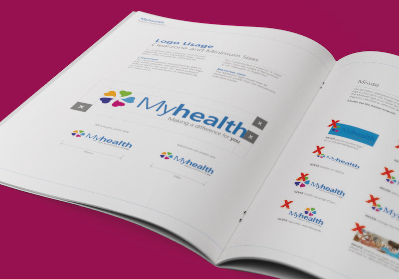
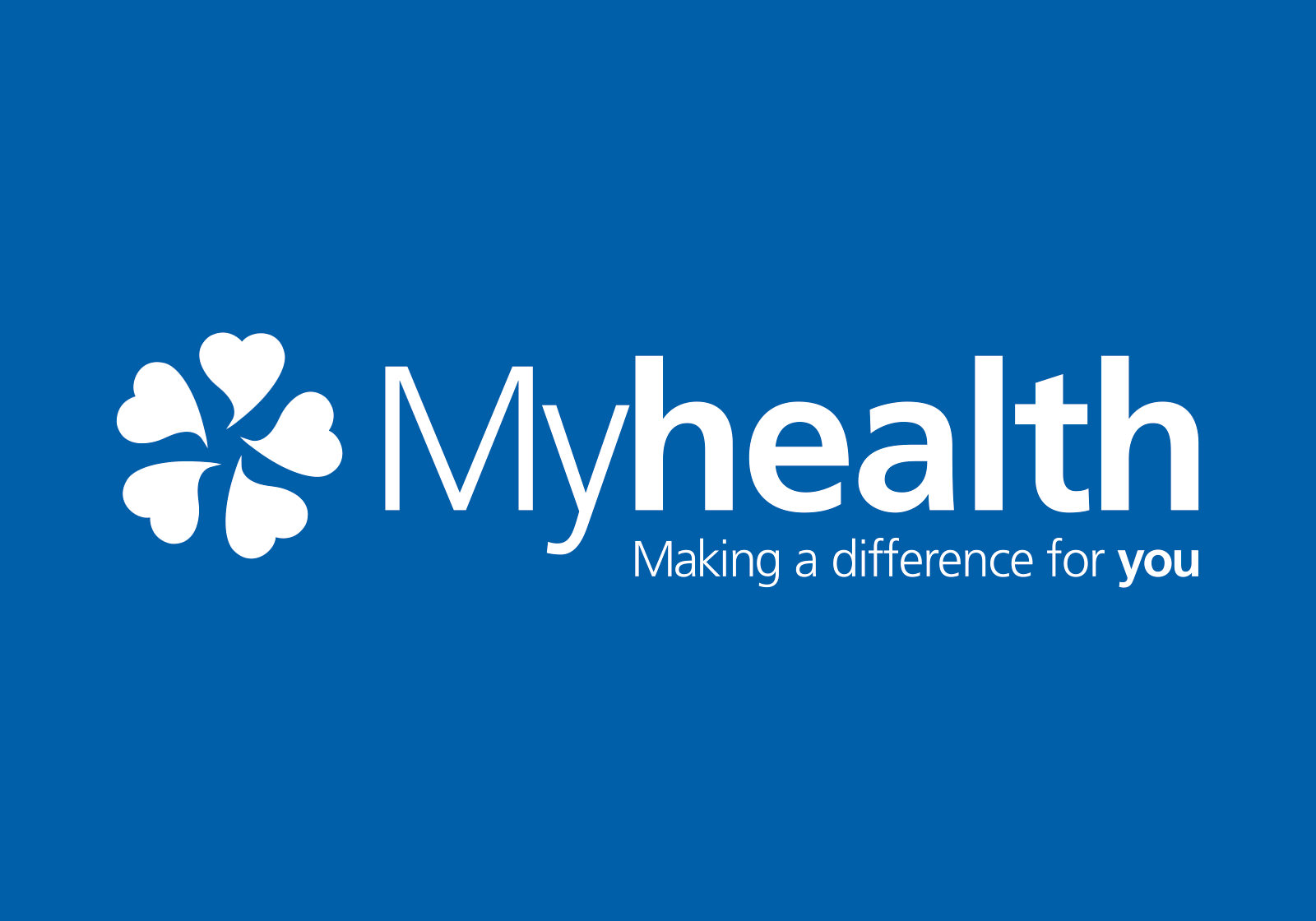
- The love heart is a symbol of care and compassion, whilst the speech bubble represents a voice. Together creating a perfect ‘logo’ for the Myhealth brand. The love heart symbols represent five areas, which have been broken down into sub brands, in a cluster they denote community, unity and togetherness.
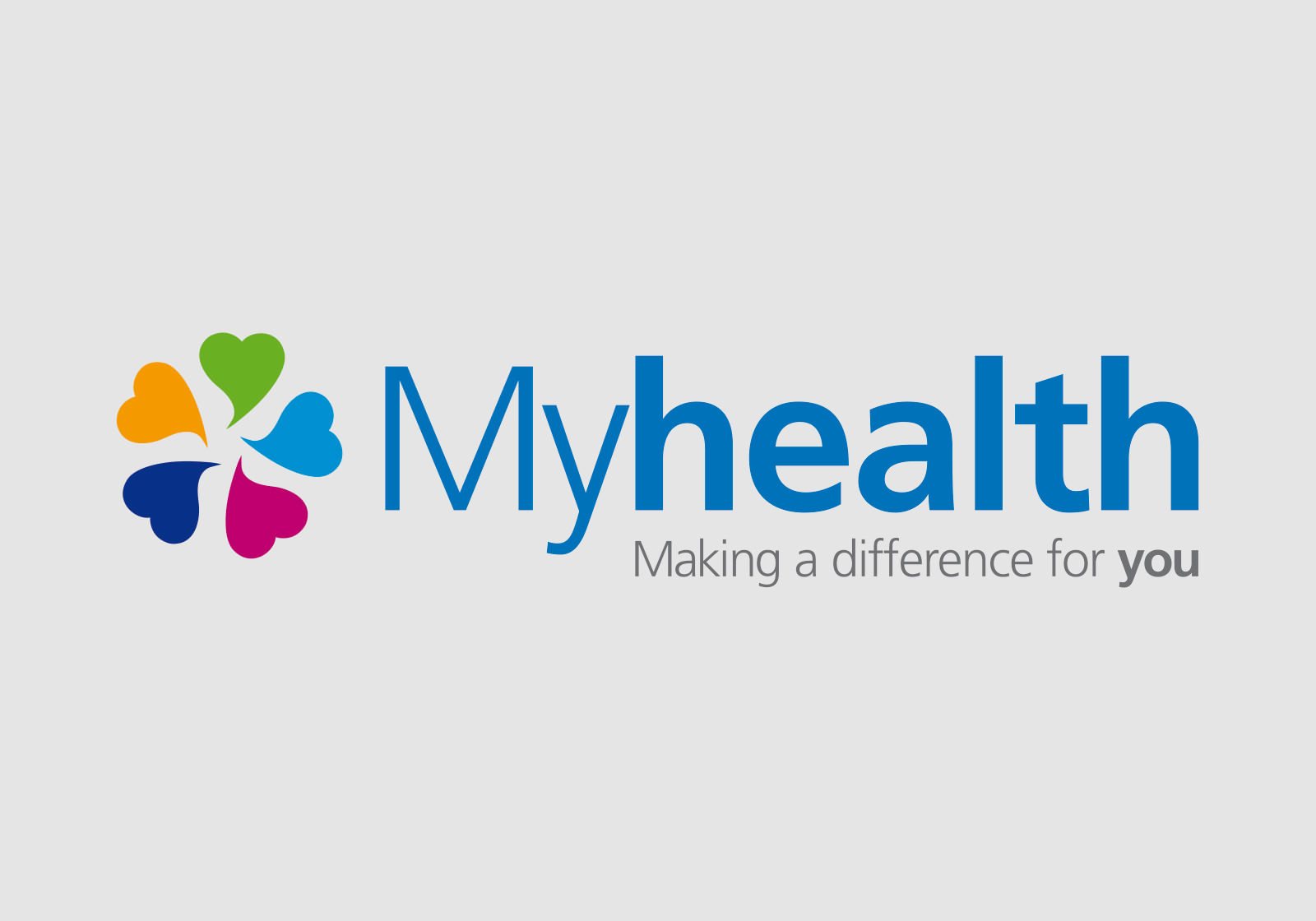
Subsequent to the main brand the sub branding has been shown, we have illustrated five areas showing how the sub branding will appear. Overall the Myhealth brand is personal and strong and can be used for many different purposes across various on and off media channels.